Rethinking Data Moves & Graphs in Existing Curriculum
By: Kristin Hunter-Thomson
Graph choice is a tricky skill to help our students build their muscles with over time. Fortunately, there are a growing number of resources to share and use with our students (see suggestions below). But, here I want to think about how we can adjust our existing activities, lessons, curriculum slightly in terms of graph choice, and other data moves, to help set our students up for success when working with graphs (maps, charts, plots, tables, etc.) and data.
Context for the lesson
Let’s look at one of the fantastic offerings by Data Nuggets (as a side note, if you are not aware of Data Nuggets definitely check them out!): Do insects prefer local or foreign foods? This lesson features super cool work about invasive species by Elizabeth Schultheis from Michigan State University.
A quick orientation to this activity at the 40,000 foot level:
-
Content Level: Level 2 (middle school and above)
-
Flesch–Kincaid Reading Grade Level: 10.9 (~10-11th grade)
-
Dataset worksheet: 2012 data
-
Science concepts: herbivory, invasive species, plants, insects, enemy release, ecology
-
Quantitative concepts/statistics: mean, variance, standard deviation (SD), standard error (SE), confidence intervals (CI)
-
Graph type: Bar
-
Variable type(s): categorical
-
Data type(s): summarized, full dataset available
The students work with Dr. Schultheis’ data to explore her hypothesis that “invasive species are not recognized by the local insect herbivores as good food sources and thus get less damage from the insects.” Through the activity introduction students learn a bit more about the system, players (native, exotic, and invasive plant species), and research undertaken by Dr. Schultheis. The students are then asked to make a prediction and use the provided data to explore the scientific question: How does insect herbivore damage compare for native, exotic, and invasive plant species?
Thinking through data moves in the lesson
Let’s think through some of the data moves that this activity has students work through before they get to analyzing and interpreting the data to answer this scientific question.
Available from worksheets provided at: http://datanuggets.org/2014/01/do-insects-prefer-local-or-foreign-foods/
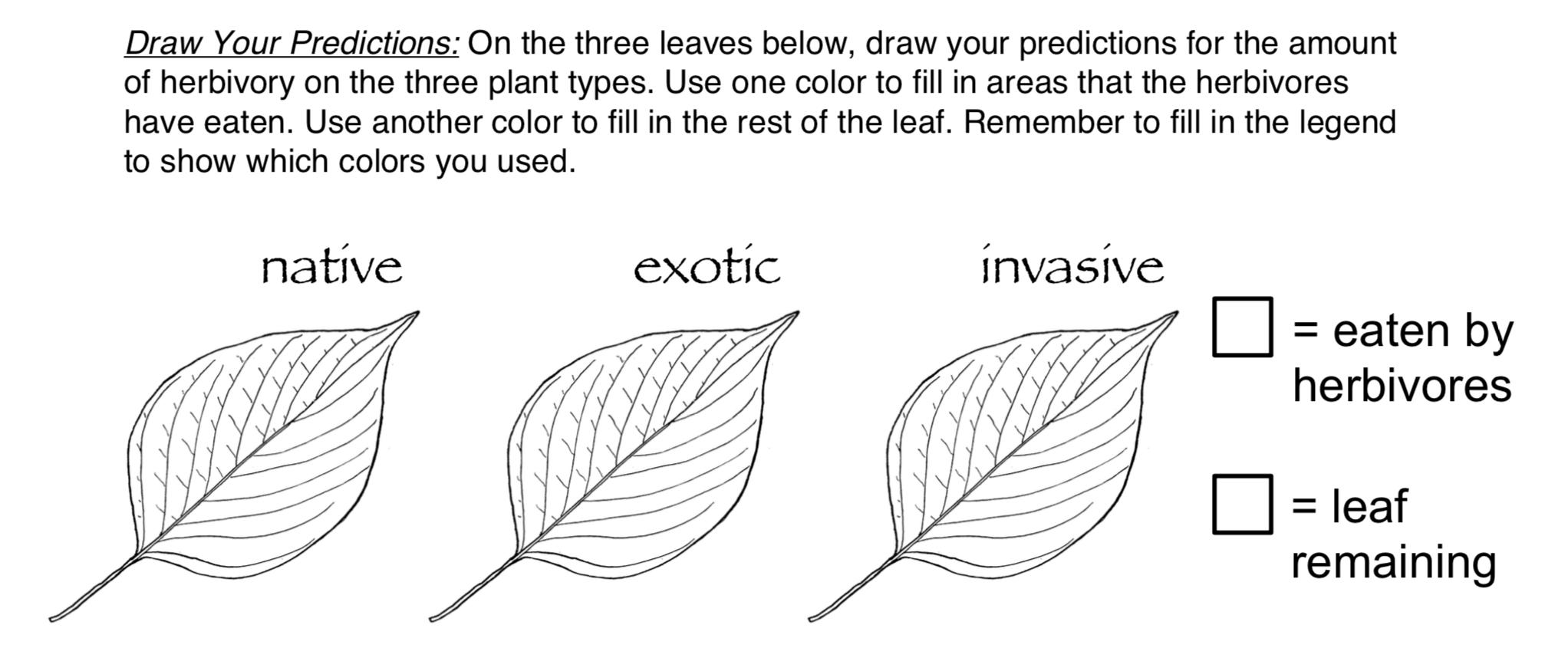
Data Move #1: Make a prediction.
Students are provided three leaves and are asked to draw onto the leaves what they predict each leaf would look like after an herbivore had the chance to nibble on the leaf.
Making visual hypotheses is a fantastic way to help students engage with the data and mentally visualize how our prose of discussing the topic would translate into what they would be able to see. This visual hypothesis asks the students to predict what the leaves looked like that Dr. Schultheis observed in the field as she was collecting her data. Another option could be to have the students create a visual hypothesis of what the data could look like based off of Dr. Schultheis’ research hypothesis.

Available from worksheets provided at: http://datanuggets.org/2014/01/do-insects-prefer-local-or-foreign-foods/
Data Move #2: Look at the data table.
Students are provided the summarized data that Dr. Schultheis collected from 2011, 2012, and 2013. The data are organized in a wide format, with the values for the Average Proportion Leaf Area Eaten by Herbivores in the cells according to Plant Type and Year (as opposed to Plant Type, Average Proportion Leaf Area Eaten by Herbivores, and Year each being their own column of data as would be organized in a long format of either the raw data or summarized data).
Data Move #3: Determine what you will use to make a graph.
Based on the data table and the provided scientific question, students are asked to think about what data they will use to answer the scientific question.
Data Move #4: Identify independent and dependent variables.
Based on the data table (and previous context information), students are asked to identify what are the independent variables and what is the dependent variable in this dataset, with an implication for how it connects to the graph.
Available from Student Worksheet A provided at: http://datanuggets.org/2014/01/do-insects-prefer-local-or-foreign-foods/
Data Move #4: Graph data.
One of the great aspects of the Data Nuggets are the different versions of the student worksheets depending on how you want to scaffold graph creation into the lesson and/or your students graph creation abilities. If using version B or C, the students are asked to make the graph themselves. The graph is provided to students in version A, so this data move is not present in that version.
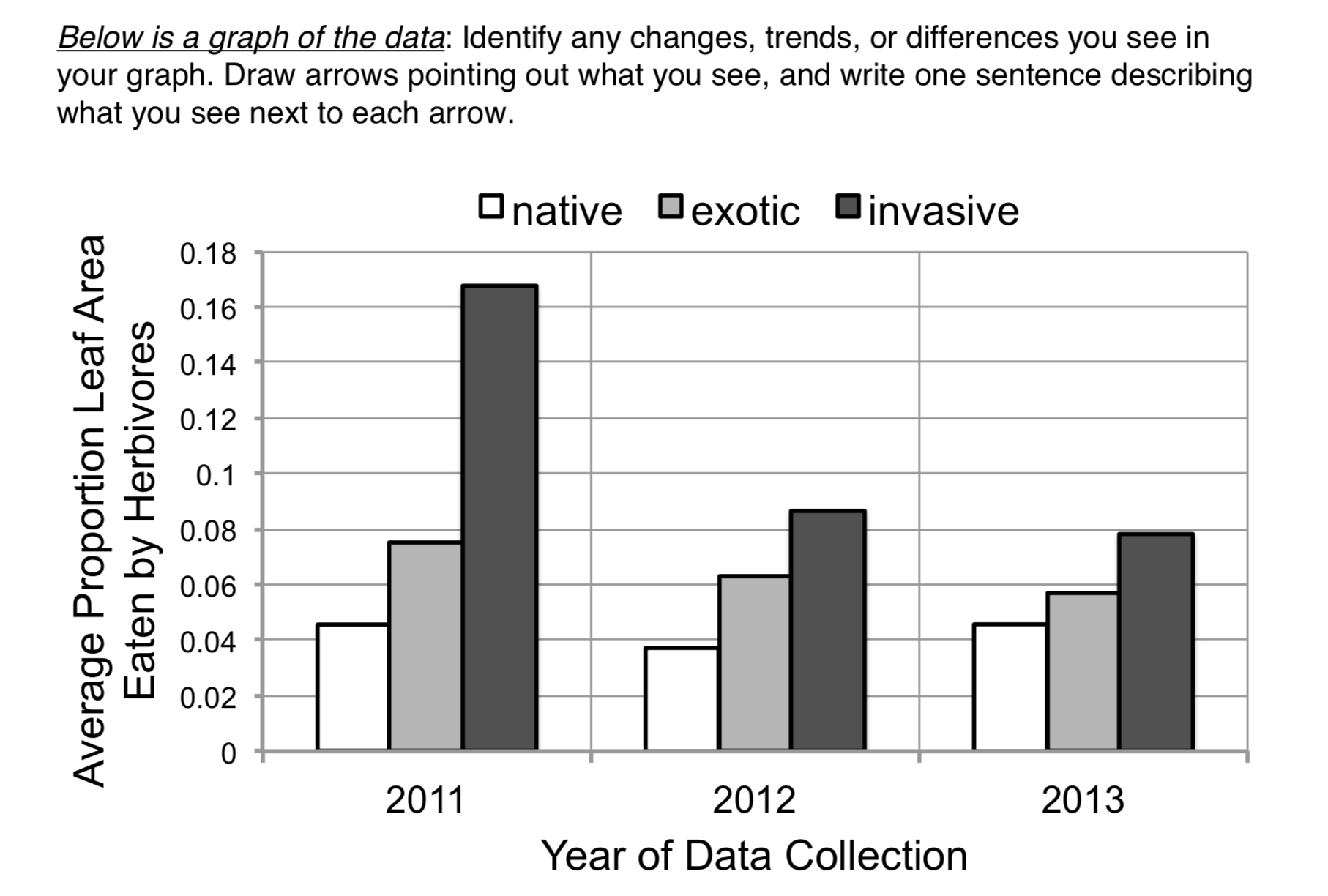
Data Move #5: Read the graph.
The activity provides (version A), or scaffolds students into (version B), a bar chart of values of the Average Proportion Leaf Area Eaten by Herbivores for each Plant Type organized by Year.
Data Move #6+: Interpret and analyze the data…
Reflecting on graph choice
As a reminder, the students are using these data to try to answer the scientific question: How does insect herbivore damage compare for native, exotic, and invasive plant species? From the question it is pretty clear that we want to look at Plant Type and Average Proportion Leaf Area Eaten by Herbivores. In essence we are trying to compare the amounts of damage on each leaf type by herbivores, so it is comparison/distribution question. Let’s look at a couple different ways of visualizing these data. Each graph type (Bar Chart of Values, Bar Chart of Sums, and Box Plot with Dots) have their pros and cons…because remember there is no perfect graph type. But spend some time thinking about which graph type may be simplest to use to answer the scientific question: How does insect herbivore damage compare for native, exotic, and invasive plant species?

Bar Chart of Values of Average Proportion Leaf Area Eaten by Herbivores for each Year and Plant Type side-by-side. From Student Worksheet A.
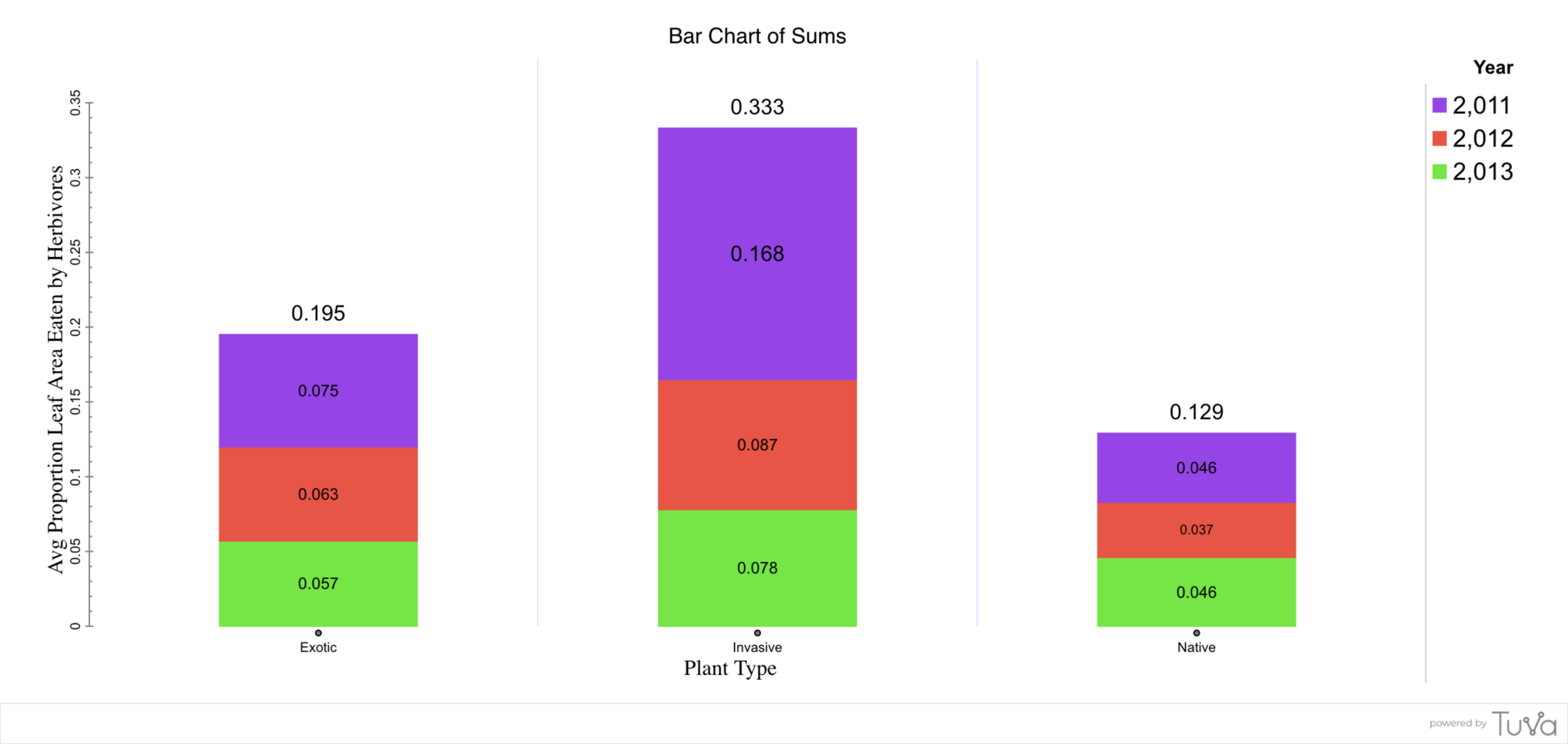
Bar Chart of Sums (stacking each Year on top of one another to get a sense of the total Average Proportion Leaf Area Eaten by Herbivores for each Plant Type). Made using https://tuvalabs.com/.

Box Plot with Dots of the Average Proportion Leaf Area Eaten by Herbivores values by Plant Type (each Year is a dot in the graph). Made using https://tuvalabs.com/.
While there is no “correct” answer, personally I find the Box Plot the simplest version to look at and quickly see that on average herbivores ate a lot of Invasive Plant Type leaves, then Exotic, then Native. As this graph type includes the data from across the Years to help give me a sense of range for that Plant Type, but focuses mostly on the two variables that I need most to answer the question (Plant Type and Average Proportion Leaf Area Eaten by Herbivores).
What does this mean for your lessons?
DON’T throw them out with the bath water! I would wager to bet that there are awesome data moves galore in the lessons you are using now. So instead of starting from scratch, think about what small adjustments could you make: 1) knowing where your students are at with their data skills, 2) knowing what you are trying to get them to with the data when that doesn’t totally align with how the lesson was originally written, and/or 3) knowing what you want to focus on as the data skill in that particular lesson. Often times the tweaks are not large for you, but can have huge pay outs for your students understanding and success with the data.
If you are stuck and wanting some help, sign up for a free 30-minute consultation.
Share with us your attempts & successes
Have you tweaked the data moves and/or graphs in an existing lesson? Share your example with us!
Graph Choice Resources
Looking to dive more into graph choice? Check out some of these other resource:
-
Maine Data Literacy Project’s Graph Choice Chart
-
Hunter-Thomson (2019). Data Literacy 101: Which is the Best Graph to Use? Science Scope 42(5): 26-31.
